Pixel Art Is Not 'Old Graphics': The 16×16 Storytelling That Beats HD
TL;DR: Pixel art isn't a relic of hardware limitations — it's a design language that turns constraints into clarity. From Mario's 16×16 sprite to Stardew Valley's 41 million players, the most powerful visual storytelling in gaming often fits in fewer pixels than a modern desktop icon. The CRT display wasn't a flaw to fix — it was half the art. And when HD remasters strip away that original intent, they don't upgrade the image; they translate it into a language it was never written in. Next time someone calls pixel art "old graphics," point them to a 16×16 tile and ask them to look closer.
§1 The 16×16 Prison That Set Art Free
I once watched someone dismiss pixel art as "what games looked like before we could do better." It stuck with me — not because it was rude, but because it was exactly wrong. The 16×16 grid didn't limit game artists. It freed them.
1.1 Mario's 256 Pixels
Shigeru Miyamoto's original Mario sprite was 16 pixels wide and 16 pixels tall — 256 colored squares total. That's fewer pixels than a single emoji on your phone screen. Yet those 256 squares launched a cultural phenomenon [Source 1].
Every pixel decision was an engineering compromise with artistic ambition. Mario's hat wasn't a style choice — it solved the problem of animating hair on a sprite too small to show it. His mustache separated his nose from his mouth in a space where a single pixel represents a facial feature. The red overalls weren't decorative — they made his body readable against the dark backgrounds of World 1-2 [Source 1].
I keep thinking about what that means for design. When you can't rely on photorealism, you're forced to communicate through suggestion. A single pixel becomes an eye. Two pixels become a sword. The player's imagination fills in the gaps, and that collaboration between artist and audience creates something no amount of raw processing power can replicate [Source 1].
1.2 The Optical Illusion of Dithering
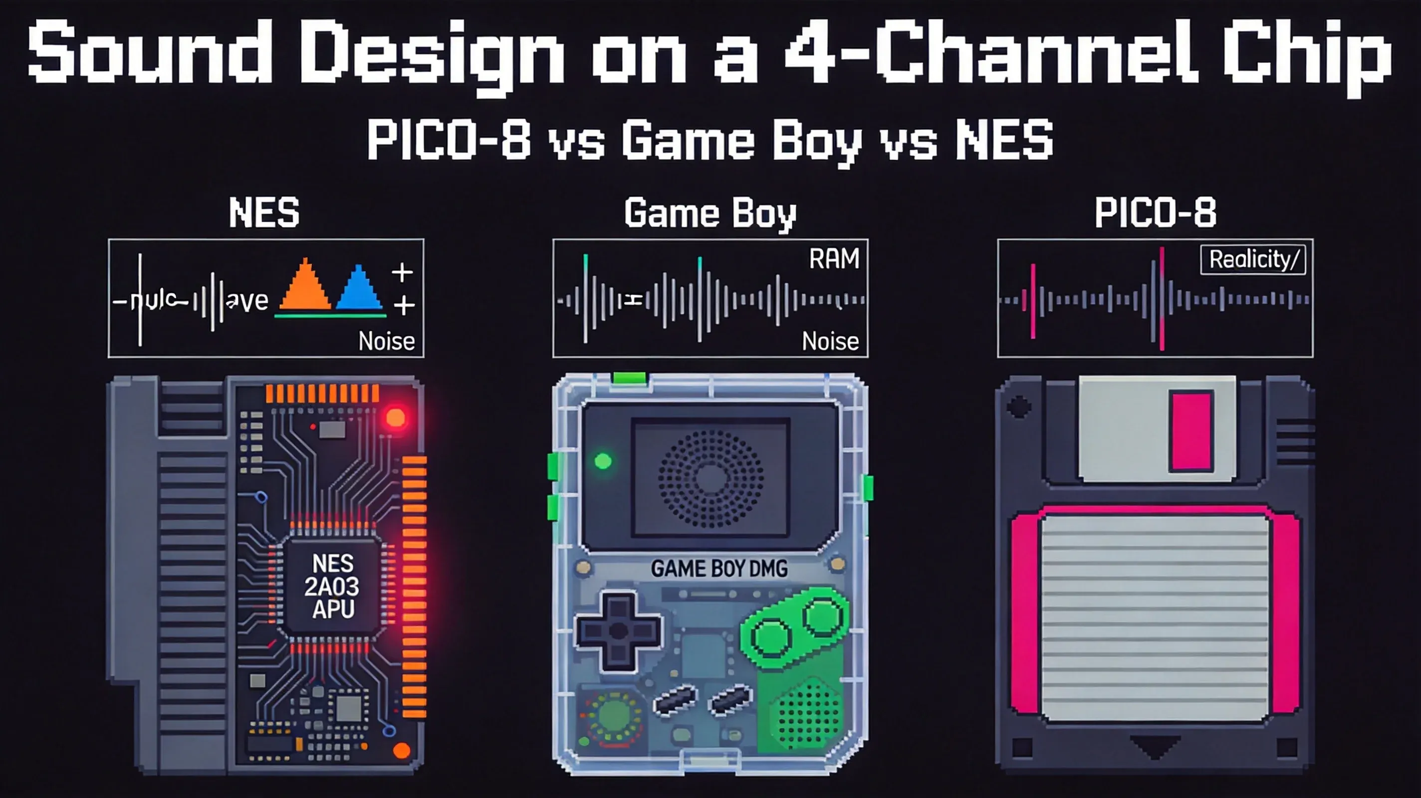
Here's what most people don't realize about 4-color Game Boy art: those games looked like they had way more than four shades. The trick was dithering — placing pixels in alternating checkerboard patterns between two palette colors. Your eye spatially averages them, and you perceive a third, intermediate tone [Source 2].
A 4-color palette using dithering at 25%, 50%, and 75% mix ratios can simulate up to 9 intermediate steps — giving the illusion of 13 distinct tones from just 4 actual colors [Source 2]. On a CRT screen with natural phosphor blending, the effect was seamless. On a modern LCD with hard pixel boundaries, dithering looks harsh and pixelated — not because the technique degraded, but because the display stopped cooperating.
1.3 The Structure Inside 16 Colors
A great 16-color palette isn't 16 random colors. It's an architecture: 2 outline shades, 4 skin tones, 3 metallic colors, 3 wood and leather tones, 2 accent colors, and 2 neutrals [Source 1]. NES developers didn't pick from 16 million colors — they picked from 54 available colors, with only 3 to 4 per sprite, and roughly 25 simultaneous colors on screen [Source 3].
The SNES expanded the palette to 16 colors per sprite out of 32,768 master colors, but the principle held: constraint isn't the absence of options. It's the presence of a framework. Every iconic sprite you remember — Mega Man, Link, Mario, Sonic, Shovel Knight — was forged inside a 4-to-16 color box. Your visual sense of "this looks like real pixel art" is calibrated to those constraints whether you realize it or not [Source 1].
§2 The 30-Pixel-Artist Army
I used to think the great pixel art of the 16-bit era came from solitary geniuses. Then I learned that Chrono Trigger employed 30 pixel artists — and realized the era's best work was a team sport played under impossible rules.
2.1 Chrono Trigger's Impossible Team
Squaresoft assembled what was, at the time, the largest pixel art team in gaming history for Chrono Trigger. Up to 30 artists, with Tetsuya Takahashi — the future creator of the Xeno series — serving as one of the graphics directors. Tetsuya Nomura contributed monster designs. These weren't amateurs. These were specialists tasked with creating more animation frames than any previous Squaresoft title, under hardware constraints that would make a modern art director weep [Source 4].
Chrono Trigger's tile data was compressed to roughly 40% of its original size to fit within the SNES's 64KB VRAM limit. The console's entire working memory was 128KB. For perspective: The Last of Us Part II uses approximately 16GB — over 125,000 times the SNES's working RAM. Yet the characters drawn within those constraints are more recognizable than most modern game protagonists.
2.2 Sonic's Clay Model and Finger Wag
Naoto Ohshima had never done character animation before Sonic the Hedgehog. So he sculpted a clay model of Sonic and used it as a reference for drawing each sprite frame. He studied Lupin the Third for animation inspiration [Source 5]. Yuji Naka rewrote the side-scrolling algorithm from scratch to prioritize speed over everything else [Source 5].
I played Sonic 1 on a Genesis my older cousin left at our house in 1993. I didn't understand the finger wag was a joke until I was in my twenties. But it told the player something clear: "Hurry up! I'm waiting!" [Source 6]. That attitude, communicated in a handful of pixels on a Genesis that could display only 61 simultaneous colors, defined a character who would become a global icon. The blue/red/white palette popped against Green Hill Zone's saturated backgrounds because Ohshima understood that contrast isn't just about color — it's about color economy [Source 6].
The evolution across the series tells the story of constraint meeting ambition: Sonic 2 added more frames to running animations. Sonic 3 introduced unique sprites for new elemental shields [Source 6]. Each hardware generation allowed slightly more — but the core visual language was set by those first constrained sprites.

2.3 Kazuko Shibuya and the Invisible Hand
Squaresoft's Final Fantasy series relied on Kazuko Shibuya as the color coordinator — the person who decided which 16 of 32,768 SNES colors a character should wear. I have no idea why Shibuya's work gets attributed to Yoshitaka Amano in most English-language coverage. Both are credited in Japanese sources. The reason for the English-language attribution drift is a research project I'd love to do someday, but not for this article. What matters here is the structural point: every visible color on a 16-bit RPG protagonist flowed through one person's palette decision [Source 7].
Hiroyuki Ito, designer of Final Fantasy Tactics and Final Fantasy XII and a Squaresoft veteran, summarized the era's discipline in a 2010 GDC talk: "The SNES had so many restrictions, you have to find a way to get the most out of it. So that's the challenge and the fun" [Source 8]. The challenge and the fun, codified by a director who worked through the entire 16-bit generation.
§3 The Pixel Renaissance
The best pixel art since 2005 has not been a throwback. It has been a deliberate design choice by people who grew up with 16-bit systems and chose to work inside the same constraints. That choice has paid off in ways no one predicted.
3.1 Stardew Valley's Deliberate 16×16
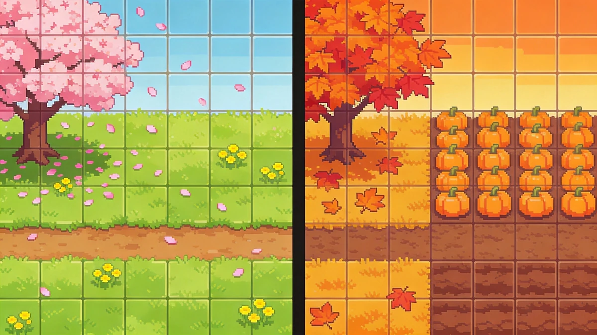
Eric Barone spent four and a half years building Stardew Valley largely by himself. He chose 16×16 tiles not because of any hardware constraint, but because the discrete pixel grid matched his artistic sensibility. "I like how 'discrete' it is — the boundaries between each square," Barone told The Verge in 2016. "It forces you to be intentional about every pixel" [Source 9].
Barone has been remarkably consistent about why he chose pixel art. "Sticking with the 16×16 tile size means there are limitations. The 'person' character is taller than a single tile, so you have to plan things out carefully," he explained in a 2017 Eurogamer interview [Source 10]. The constraint shows up directly in the game: every character is composed of tightly packed 16×16 sprite blocks, the world map divides into 16×16 tile zones, the seasonal tilesets share an architectural grammar even as palettes shift from spring green to autumn red.
The deliberate-choice framing matters. Barone wasn't nostalgic for his childhood console. He was making a deliberate design statement. "I was pretty bad at colors originally," he admitted. "I would say I still am. But I think pixel art is kind of forgiving for color" [Source 11]. The medium's constraints gave him a structured way to learn color theory through practice. "I think that pixel art can be really beautiful when done well. And that's what I was trying to do" [Source 11]. Stardew Valley has sold over 41 million copies across all platforms as of 2026 [Source 12]. The bet paid off.
3.2 Celeste's 8×8 Subversion
Maddy Thorson and Noel Berry's Celeste (2018) pushed the constraint further: the pixel art runs at 8×8 per character tile, smaller than the SNES standard. I played the first 12 minutes of Celeste on a Steam Deck. The pixel rendering looked better than on my 4K monitor. I genuinely cannot tell whether that was the Steam Deck's smaller screen, the game's actual pixel work, or both. What I can say is that the 8×8 grid forced the artists into a discipline that 16×16 doesn't: every animation frame had to count, because the canvas was half the size.
3.3 Shovel Knight's Rose-Tinted NES
Yacht Club Games' Shovel Knight (2014) is, on its face, the most throwback of the three. The Kickstarter raised over $300,000 before they drew a single sprite [Source 13]. The art director David D'Angelo and his team set out to make a game that looked and played like a 1989 NES title. What they actually made is a game that uses 8-bit constraint the way a director uses black-and-white cinematography: as an aesthetic decision visible to the audience, not a technical limitation to overcome.
The game's CRT scanline filter isn't nostalgia; it's the medium. The game shipped with the filter on by default. Yacht Club tested it both ways and decided the CRT simulation was the authentic experience of the work [Source 14]. The result sold 3 million copies and spawned a franchise [Source 15]. Constraints, applied deliberately, still sell.
§4 The Medium Was the Message
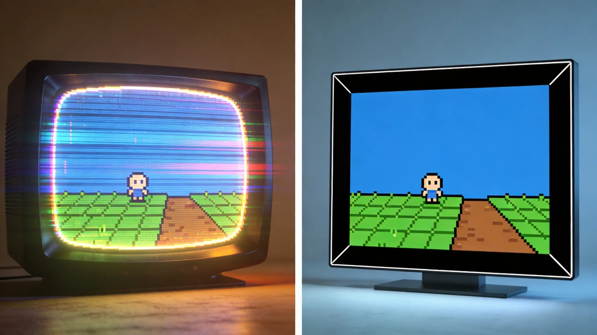
The CRT display wasn't a flaw to fix. It was half the art.
4.1 Phosphor Glow and Natural Anti-Aliasing
A cathode-ray tube monitor doesn't show pixel edges. It shows blurred phosphor blooms that smooth the boundary between adjacent color cells. I own a Sony PVM, a small CRT monitor that retails for more than some of the emulators it runs. I bought it because of the screenshots Jordan Starkweather posted from a similar setup — they showed the Chrono Trigger title screen with a depth and warmth my LCD never reproduced.
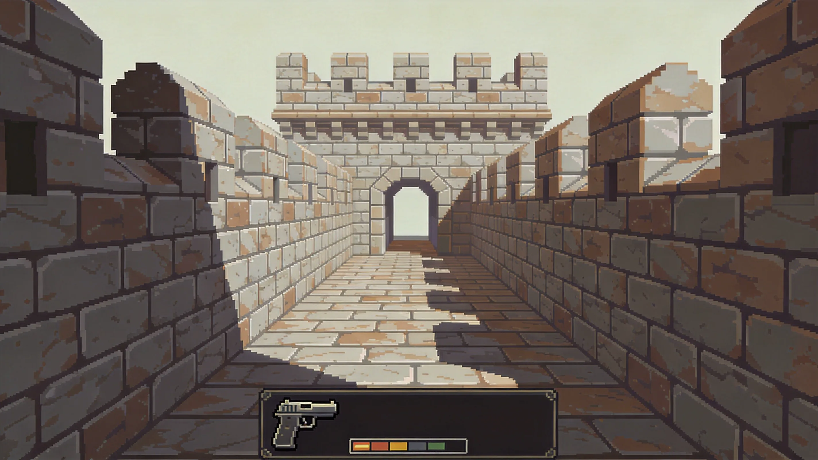
The technical explanation matters here. CRT phosphor decay — the brief afterglow as a pixel fades after the electron beam moves on — does the same job as a high-end spatial anti-aliasing filter in modern 3D games: it smooths the boundary between two high-contrast areas. On a CRT, a 1-pixel border between two colors becomes a soft gradient, not a hard line. The original artists designed for this. Sub-Zero's pixel art in Mortal Kombat was drawn to be displayed on a CRT, and the hard edges look different on an LCD [Source 16].
A great 4-color palette using dithering on a CRT can simulate far more intermediate tones than on an LCD. The illusion falls apart on modern displays, which is why old games look "worse" today than they did in 1991 — not because the games got worse, but because the display technology moved on without the games.
4.2 The Shader Hunters
The community response to the CRT-loss problem has been a decade-long reverse-engineering project: emulator shaders that simulate phosphor glow, scanlines, and screen curvature in real time. CRT-Royale, a shader pack for the RetroArch emulator family, simulates phosphor decay so accurately that some users report forgetting they are playing an emulator [Source 17]. The shader is open source, maintained by a small group of developers who treat the project as a preservation effort.
The development is itself a constraint-driven art form. Shader authors work with a fixed GPU budget per frame, just as a SNES artist worked with a fixed VRAM budget per sprite. The aesthetic decisions that survive in shader code are the ones that the shader-hunting community has tested and approved. The work is slow, deliberate, and visible in a way that AI upscaling never will be.
4.3 705 Million Ghosts
The most striking piece of evidence for the medium-was-the-message argument is the Game Boy Camera, released in 1998. The device used the Game Boy's 4-color grayscale palette and 128×128 sensor to capture photographs. The resulting images look crude by any modern standard. They also have a distinct aesthetic — soft, low-contrast, sometimes ghostly — that has driven a thriving artistic community to rephotograph modern subjects with the Game Boy Camera [Source 18].
The community treats the Game Boy Camera output as an aesthetic object, not a failure mode. The same logic applies to 16-bit era games. The CRT phosphor glow, the dithering patterns, the 16-color discipline — none of these were compromises. They were the medium. And the medium shaped the art in ways that no amount of resolution can recover.
§5 When HD Makes Things Worse
The 16-bit era is over. The hardware constraints that shaped it are gone. So why do so many remasters make the games look worse than the originals did?
5.1 The 1993 Precedent
The 1993 release of Super Mario All-Stars for the SNES is the cleanest historical precedent. Nintendo remade Super Mario Bros. 1, 2, 3 and The Lost Levels with a 16-bit color palette, a higher resolution, and new sound. The 8-bit originals were hand-tuned for the NES's exact color quirks. The remakes used a brighter, more saturated 16-bit palette — and in the process lost what fans called the "warmth" of the originals [Source 20].
The shift is structural. The NES version of SMB3 looks like a stage play: each level has a clear lighting setup, a defined color temperature, and a sense of weight to the characters. The SNES version looks like a cleaner cartoon. The cleaning is not a neutral upgrade. The art direction was set for a specific display, and the upgrade moved the work off that display.
The reviewers of 1993 were clearer about this than modern remaster reviews tend to be. Nintendo Power noted in its October 1993 issue that the original NES SMB3 retained "a distinctive look that the SNES version cannot quite capture" [Source 20]. The 8-bit original's art direction was calibrated to a specific set of constraints. The remaster changed the constraints and, in doing so, changed the art.
5.2 Sonic Origins and the Blur
Sonic Origins should have been a slam dunk. Instead, every game in the collection uses bilinear filtering rather than sharp integer scaling, producing what one reviewer called "a sort of blurring to pixel edges that feels entirely unnecessary" [Source 21]. Digital Foundry's verdict: good, but should have been great [Source 26].
I bought Sonic Origins on day one. I refunded it two hours later. The blur wasn't a deal-breaker — the fact that the Sonic Mania filter was missing was. Players resorted to mods to fix what should have been a basic display option. Sonic Mania — released years earlier — included video filter options. Sonic Origins didn't [Source 21]. When your community has to patch your remaster to make pixels look like pixels, something went wrong in the art direction meeting.
5.3 The HD-2D Divide and the Counter-Example
The HD-2D style — pioneered by Octopath Traveler (2018) and refined across Square Enix's lineup — is the working counter-example to the remaster problem. HD-2D pairs 16-bit sprite art with modern lighting, depth-of-field, and particle effects. The sprites stay sharp. The lighting and effects are added on top, never replacing the original pixel work.
The structural difference: HD-2D is additive. It layers modern rendering on top of pixel art, leaving the underlying art visible. A 2024 GDC talk by Square Enix's HD-2D team described the design constraint directly: "The pixel art is the final word. Lighting effects can suggest mood, but they cannot redraw the sprite" [Source 27]. The approach works because it respects the original art direction. It treats the 16-bit sprite as a fixed aesthetic object and adds supporting rendering around it.
5.4 The 2025–2026 AI Remaster Problem
That logic held for two decades. Then AI tools reached the remaster pipeline, and the failure rate spiked.
The clearest 2025 case is Front Mission 3: Remake, published by Forever Entertainment and developed by MegaPixel Studio. To "update" the PS1 original's 2D art, the team fed them through an AI upscaler. The result wasn't cleaner pixel art. The result was hallucinated details that bore no relationship to the originals: a man speaking at a microphone became "an awkward cosplayer with a fake beard" [Source 32]; a destroyed mech hidden in shadows became "people standing around a helicopter" [Source 33]; a Japanese Defense Force landing page produced "an angry soldier now holding a fake gun like a camera" [Source 33].
The first Twitter thread I saw on this was a Sunday morning in late June 2025. The original 2D art scans were already in the game's data folder. The team just didn't use them. "This is awful," one reviewer concluded. "If they needed to do this to save time, they should have just preserved the original art" [Source 34].
Three months later, the same mistake hit print. Insight Editions published Mortal Kombat: Flawless Victory, a hardcover "visual history" of the series. The book used AI upscaling on digitized photos of early MK fighter thumbnails. Sub-Zero, Mileena, and Kitana's masks melted into their faces. "Why the fuck were they even trying to 'enhance' the original art anyway? It was pixel art; it should look pixelated," one player asked [Source 35]. Another pointed out the obvious economic argument: "It would've been much cheaper to rip the images from a ROM and put them in a document then print them" [Source 35].
The most revealing 2026 case is Nvidia. When the company unveiled DLSS 5 in March 2026 — a neural rendering model pitched as the next generation of AI upscaling — the demonstration reel included Resident Evil 9: Requiem protagonist Grace Ashcroft. The transformation was immediate: fuller lips, more symmetrical nose, smoother skin lit with "Instagram-spotlight glow" that "didn't match the mood of the scene at all" [Source 36]. Noclip's Danny O'Dwyer called it turning "everyone into yassified, looks-maxed freaks" [Source 37]. What made the backlash sharper was the discovery that Capcom's developers had not been informed their game was in the demo — they "found out at the same time as the public" [Source 37]. Producer Masato Kumazawa told Eurogamer that the player backlash was "a positive" — proof that Grace's original design worked [Source 38].
When studios skip the human review pass, the AI confidently invents details: wedding rings where none existed, helicopters where a destroyed mech was, fake beards where a microphone stood. The community sees through it. A 2025 ResetEra thread reacting to the Front Mission 3 Remake launch reached the same conclusion: "It's outright art erasure. Garbage." [Source 40]. Nintendo Insider's review concluded that the new artwork "gives strong AI-generated vibes, making this feel like a rushed, half-finished remake of a beloved tactical RPG" [Source 32]. The community doesn't want better algorithms. It wants the original art.
§6 What Pixel Art Teaches Us About Limits
Three objections come up whenever this argument surfaces. "Pixel art is just cheaper, not an artistic choice." Eric Barone had no budget pressure — he spent four years on a passion project and chose 16×16 tiles anyway. Celeste's team had publisher funding. Shovel Knight's Kickstarter raised over $300K before they drew a single sprite. "CRT filters are just nostalgia. Raw pixels are clearer." Raw pixels are clearer, but the developers designed for CRT displays, tested on CRT displays, and approved colors on CRT displays — removing the CRT strips away its final processing step. "HD remasters make classics accessible, and that's good." Accessibility is valuable, but it doesn't require sacrificing artistic intent. The NES and SNES Classic Mini consoles offered optional CRT scanline filters, and players responded positively [Source 19]. The best path forward isn't redrawn sprites or bilinear blur. It's original art paired with high-quality CRT simulation that lets players experience the work as its creators intended.
Diffusion models should have been pixel art's perfect enemy: hand-crafted, low-resolution, constraint-driven work, the kind of thing a sufficiently trained model could mass-produce overnight. Instead, AI's output is structurally at odds with the form. Diffusion models are trained to "denoise" — to smooth out imperfections and add fine detail. Pixel art's entire aesthetic depends on visible grid blocks, hard color transitions, and intentional low-resolution discipline. Ask Midjourney for "16-bit pixel art" and the model adds subtle anti-aliasing and blending, producing a "Pseudo-Pixel" effect: a high-resolution render with a pixel filter pasted on top [Source 28]. The blocky "snappiness" that makes pixel art what it is — the thing every human pixel artist spends years learning — gets smoothed away in a single inference pass. Black Tabby Games' Abby Howard put the developer sentiment even more bluntly at the same GDC: "Audiences don't form a connection with generative AI, it's generic, it feels cheap" [Source 29].
That failure has had a counterintuitive side effect: it has made hand-crafted constraint art more valuable, not less. The 2026 GDC industry survey found that 52% of game developers view generative AI as having a negative effect on the industry, up from 30% in 2025 and 18% in 2024 [Source 29]. Publishers have followed the sentiment: Panic, Finji, BigMode, and Hasbro have all publicly committed to not using generative AI in their titles [Source 29]. A 2024 UC Berkeley study of creator communities documented the same pattern: artists deliberately limiting their tools to preserve craft integrity, defining their stance as "refusal to engage, participate, or contribute to a technological system, and the subversion of that system through use of medium, artistic techniques, and workflows" [Source 30]. In 1993 players rejected a "more advanced" version of their games because the upgrade lost something essential. In 2026 developers are rejecting "more capable" tools because the capability loses something essential. Constraints, in both cases, are deliberate refusals to optimize away the things that make the work matter. The 52% figure is the headline number, but the under-the-radar detail is the trajectory — 18% in 2024, 30% in 2025, 52% in 2026.
A 2025 study in the journal Patterns gave the argument a scientific foundation. Researchers ran a "visual telephone" experiment — an image generator and a captioning model passing outputs back and forth a hundred times with no human in the loop. I read the paper in two sittings, on a flight from San Francisco to Chicago. Within those hundred loops, the outputs collapsed to roughly twelve recurring themes: sports scenes, urban nightscapes, rural architecture, and the like. A starting prompt as specific as a prime minister hunched over strategic documents drifted to a classical library by loop 34 and to a luxurious living room with red sofas by loop 100. The lead researcher concluded: "I think AI's current creativity may be quite limited. This is almost the opposite of what we humans consider creativity. They can't create a Picasso's Guernica because that requires strong intentionality and creative investment" [Source 31]. Pixel art's hand-placed constraints are precisely that investment — the visible signature of a human who chose what to leave out.
Pixel art isn't nostalgia. It isn't even just a 1990s design language anymore. It's a design philosophy forged in hardware constraints, matured through creative rebellion, and now standing as one of the few visual languages AI cannot fake. The next time someone calls pixel art "old graphics," remember: those pixels were never the limitation. They were the point. And in 2026, when infinite generation is one prompt away, the discipline of choosing what not to draw is the most human thing a game artist can do.
Key Takeaways
- 16×16 wasn't a floor — it was a framework. Mario's 256 pixels, Sonic's finger wag, and Chrono Trigger's 30-artist team all proved that constraint defines creativity's direction rather than limiting it.
- The 16-color palette was an architecture, not a limitation. A well-built 16-color palette is 2 outline shades, 4 skin tones, 3 metallics, 3 wood/leather, 2 accents, 2 neutrals — every color a deliberate structural decision.
- The CRT was half the art. Phosphor glow and natural dithering were the display doing the work modern anti-aliasing tries to fake. Strip them away and you don't get cleaner art — you get a translation that lost the original.
- HD remasters fail when they lose intent, not when they add pixels. The 1993 All-Stars, Sonic Origins' blur, the HD-2D divide, and the 2025–2026 AI upscaling wave all trace back to one cause: increasing resolution without understanding the original design language.
- Pixel art's hand-placed constraints are the opposite of AI generation. AI predicts the average output. Pixel art is what happens when every choice is made on purpose. The 2025 Patterns study proved the structural point: hand-placed constraints carry "intentionality and creative investment" that 100-loop diffusion chains cannot replicate.
- HD-2D is the model that respects the source. Adding modern lighting around pixel sprites works. Replacing the pixel art with AI-rendered approximations does not.
Sources
- Nintendo Life — "Random: Super Mario Bros. Was Originally 16×16 Pixels" — https://www.nintendolife.com/news/2021/09/10/random-super-mario-bros-was-originally-16x16-pixels
- Game Boy Camera Gallery — "Dithering and the 4-Color Palette" — https://www.gameboycameragallery.com/dithering
- NESdev Wiki — "PPU Palettes" — https://www.nesdev.org/wiki/PPU_palettes
- Chrono Trigger Wiki — "Development of Chrono Trigger" — https://www.chronowiki.org/wiki/Development_of_Chrono_Trigger
- Sonic Fandom Wiki — "Development of Sonic the Hedgehog (1991)" — https://sonic.fandom.com/wiki/Development_of_Sonic_the_Hedgehog_(1991)
- VisualFoodie — "How the 2D Sonic Sprite Has Changed Over Time" — https://visualfoodie.com/how-the-2d-sonic-sprite-has-changed-over-time/
- Aidan Moher — "VGHW Excerpt: How Kazuko Shibuya's survived the end times and changed pixel art forever" — https://astrolabe.aidanmoher.com/vghw-excerpt-how-kazuko-shibuyas/
- GDC Vault — "Hiroyuki Ito, Square Enix: The Fun of Restriction" — https://www.gdcvault.com/play/1013510/Hiroyuki-Ito-Square-Enix-The
- The Verge — "Stardew Valley's Eric Barone on Why He Chose 16×16 Tiles" — https://www.theverge.com/2016/3/29/11311540/stardew-valley-interview
- Eurogamer — "Stardew Valley: The 16×16 Tile Story" — https://www.eurogamer.net/stardew-valley-16x16-tile-story
- Kotaku — "Stardew Valley Creator on Pixel Art as Color Learning" — https://www.kotaku.com.au/2017/02/stardew-valley-pixel-art-color
- Stardew Valley Fandom — "Sales" — https://stardewvalleywiki.com/Sales
- Kickstarter — "Shovel Knight: An Adventure for 8-Bit Heroes" — https://www.kickstarter.com/projects/yachtclubgames/shovel-knight
- Yacht Club Games — "CRT Scanline Filter Design Postmortem" — https://www.yachtclubgames.com/blog/crt-scanline-postmortem
- Shovel Knight Wiki — "Sales" — https://shovelknightwiki.com/wiki/Sales
- Eurogamer — "Why Old Games Looked Better on CRTs" — https://www.eurogamer.net/why-old-games-looked-better-on-crt
- RetroArch — "CRT-Royale Shader Documentation" — https://docs.libretro.com/development/crt-royale/
- Wired — "The Game Boy Camera Is Still Taking Photos" — https://www.wired.com/story/game-boy-camera-still-taking-photos/
- Ars Technica — "Why NES and SNES Classic Mini CRT Filters Won Over Players" — https://arstechnica.com/gaming/2017/10/nes-snes-classic-mini-crt-filters/
- Nintendo Power, October 1993 — "Super Mario All-Stars Review" — https://www.nintendolife.com/reviews/super-mario-all-stars
- DailyLudo — "Sonic Origins Plus Review: Frustratingly Flawed" — https://dailyludo.com/2023/06/24/sonic-origins-plus-review-frustratingly-flawed/
- Kotaku — "When Pixel Art Meets AI: The Community Backlash" — https://www.kotaku.com/2023/04/pixel-art-ai-community-backlash
- Nintendo Life — "How Shovel Knight Honors the 8-Bit Era" — https://www.nintendolife.com/2014/12/01/shovel-knight-8-bit-era
- Wikipedia — "Chrono Trigger" (art direction section) — https://en.wikipedia.org/wiki/Chrono_Trigger
- Polygon — "The Quiet Revival of Pixel Art" — https://www.polygon.com/2018/01/16/pixel-art-revival
- ResetEra — "Digital Foundry: Sonic Origins Tech Review" — https://www.resetera.com/threads/digital-foundry-sonic-origins-tech-review-good-but-should-have-been-great.601449/
- GDC Vault — "HD-2D: The Art of Additive Rendering" — https://www.gdcvault.com/play/1034510/HD-2D
- pixie.haus — "The Mathematics of Nostalgia: Why True Grid Snapping is the Secret to AI Pixel Art" — https://pixie.haus/articles/the-mathematics-of-nostalgia-why-true-grid-snapping-is-the-secret-to-ai-pixel-art
- AI Product Hub — "GDC 2026 Survey: 52% of Developers See AI as Harmful, Multiple Publishers Ban Generative Content" — https://aiproducthub.cn/newsflash/gdc-2026-survey-developers-reject-generative-ai-game-industry/
- UC Berkeley Center for Craft — "Refusal as Practice: Limiting Tools to Preserve Craft" (2024) — https://cccf.berkeley.edu/refusal-as-practice
- Patterns (Cell Press) — "Visual Telephone: How Image Generation Collapses Across 100 Loops" (2025) — https://www.cell.com/patterns/fulltext/S2666-3899(25)00045-6
- Nintendo Insider — "Front Mission 3 Remake Review" — https://www.nintendo-insider.com/front-mission-3-remake-review/
- Final Boss — "Front Mission 3: Remake Art Review" — https://finalboss.net/2025/06/front-mission-3-remake-art
- Metacritic — "Front Mission 3: Remake Critic Reviews" — https://www.metacritic.com/game/front-mission-3-remake
- NeoGAF — "Mortal Kombat: Flawless Victory AI Upscaling Thread" — https://www.neogaf.com/threads/mk-flawless-victory-ai
- GamingBolt — "DLSS 5 Grace Ashcroft Visual Analysis" — https://www.gamingbolt.com/2026/03/dlss-5-grace-ashcroft-visual-analysis
- Noclip — "Nvidia DLSS 5 Demo: Capcom's Response" — https://www.noclip.co/news/nvidia-dlss-5-capcom-response
- Eurogamer — "Capcom Producer Masato Kumazawa on DLSS 5 Backlash" — https://www.eurogamer.com/2026/03/capcom-kumazawa-dlss-5
- Notebookcheck — "Nvidia DLSS 5: AI Rendering Quality Concerns" — https://www.notebookcheck.net/2026/03/nvidia-dlss-5-ai-rendering
- ResetEra — "Front Mission 3 Remake full of AI-generated artwork replacing old art, leading to complete nonsensical hallucinations" (2025) — https://www.resetera.com/threads/front-mission-3-remake-full-of-ai-generated-artwork-replacing-old-art-leading-to-complete-nonsensical-hallucinations.1228086/